As countries around the world face a second or third wave of the COVID-19 pandemic, there is renewed interest in public data on epidemic outcomes including reported deaths, cases, testing, hospitalization, and intubations. As cases started climbing around the world, deaths in many areas remained constant, but it was only a matter of time before that was going to change. As one report noted:
Something rather odd is happening in the two European nations worst hit by COVID-19. The UK and Italy have a rising number of cases but a stable and very low number of deaths, even weeks after the cases started rising again.
When would we know how soon deaths would start to pick up? By what method could we know?
The number of reported deaths — as with anything we measure — will fluctuate. Without a method to understand if these changes simply reflect random variability, we will struggle to recognize if conditions are improving or deteriorating. Governments and institutions face decisions about opening and closing our societies that could be the difference between life and death.
How can we know which patterns of variation in reported data signal a meaningful change in epidemic conditions – and which patterns do not? At the cornerstone of the science of improvement is a theory of variation designed to monitor changing systems through a relatively simple chart method developed by Walter Shewhart almost a century ago. The Shewhart chart method and theory has been applied successfully to some of the world’s most pressing problems in healthcare and society. In a global pandemic, Shewhart’s charts have been an invaluable tool in making sense of an increasingly complex data environment because they provide a theory for understanding variation in data that can serve as a basis for taking action. Such methods are needed to learn from reported COVID-19 data to support leaders and organizations making decisions and taking actions.
The Shewhart chart:
- plots the reported data over time,
- establishes a center line (average of all data points) and upper and lower limits within a given period,
- fits the centerline and limits to the trajectory of the data.
There are statistical rules for Shewhart charts to signal special causes of variation in reported data patterns (i.e., not part of the daily fluctuations we expect to see). Two that have been applied to COVID-19 include:
1. any one data point above the upper limit or below the lower limit and
2. eight consecutive data points above or below the center line.
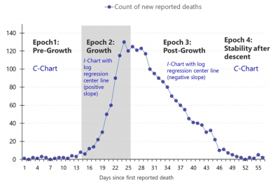
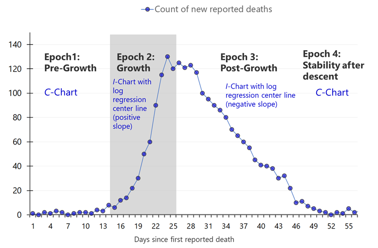
Countries around the world are experiencing the epidemic differently, and many locations are finding that the frequency of disease and death has come in waves. To model the trajectory of COVID-19 reported daily deaths, we have created hybrid Shewhart control charts to model for a specific geographical region one or more particular epochs of the epidemic. We are modeling this trajectory with the four epochs shown in Figure 1.
Figure 1. Four epochs associated with daily reported COVID-19 deaths
Below is an example of our hybrid Shewhart chart for the United Kingdom as of November 1, 2020 from the ISQua COVID-19 research page that makes charts available for all countries with daily updates. At this time, the United Kingdom is experiencing their second Epoch 2 growth of this pandemic (Figure 2).
Figure 2. United Kingdom daily reported COVID-19 deaths (March 7 – November 1, 2020)
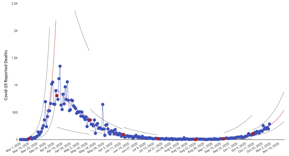
The red dots signal the approximate day when a pattern in the data indicated a meaningful change. Regarding rapid detection of these changes, we can select the date range on the toolbar and see on the image below (Figure 3) that the initial sign of increased COVID-19 deaths in the United Kingdom was on September 18 (first red data point) and then again on October 16 (last red data point). Both red dots signaled eight or more consecutive days with reported deaths above the centerline – one of the two signals the chart is designed to detect.
Figure 3. United Kingdom daily reported COVID-19 deaths (September 1 – November 1, 2020)
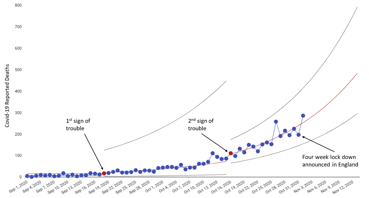
Ironically, on the same day that our chart detected the first meaningful increase in COVID-19 daily deaths in the United Kingdom, news outlets were reporting on why the number of deaths was so low and stable given the increase in COVID-19 cases, referencing weekly data reports from the Office of National Statistics. Looking at COVID-19 deaths and cases daily and weekly is critical, but without a method to distinguish between normal fluctuations in the data and changes that are special, we risk flying blindly throughout the rest of the pandemic reacting to individual data points. What would have happened if news reports and the Office of National Statistics did not report “low deaths” around the time of September 17, but rather identified it as an early signal of trouble – giving the country’s leadership and people more than a month’s head start on what was to come? On October 31, a four-week lock down for England was announced – 44 days after the Shewhart chart detected a signal that the trajectory of daily reported deaths had changed for the worse in the UK as a whole.
We see the same situation unfolding in many countries now, including Italy and the United States. We cannot continue to give COVID-19 a head-start on our actions because we are responding to individual or weekly data points. Whether we are measuring hospitalizations, cases or deaths, we must apply an empirically-based theory of variation to understand the trajectory of the virus that can guide our actions and the time-tested Shewhart Chart is our best method to do this.